Scikit-Learn Pipelines for Clustering
En esta página
- Dataset: Digits
- 1. Import Required Libraries
- 2. Load and Explore the Digits Dataset
- Dataset Characteristics
- Feature Scaling Demonstration
- Interpretation of Results
- 4. Build and Train the Clustering Pipeline
- Pipeline Definition and Training
- Training Statistics
- Interpretation of Training Results
- 4.3. Visualizing Cluster Centers
- 5. Evaluate Clustering Performance
- Unsupervised Metrics (Ignoring True Labels)
- Supervised Metrics (Use True Labels for Comparison)
- 6. Visualize Clustering Results
- What is PCA?
- Visualization & Analysis
- 7. Choosing the Number of Clusters (K)
- The Elbow Method
- Silhouette Method
- 8. Key Takeaways
- What We Learned
- Limitations of K-Means
- When to Use K-Means
- Best Practices Demonstrated
Dataset: Digits
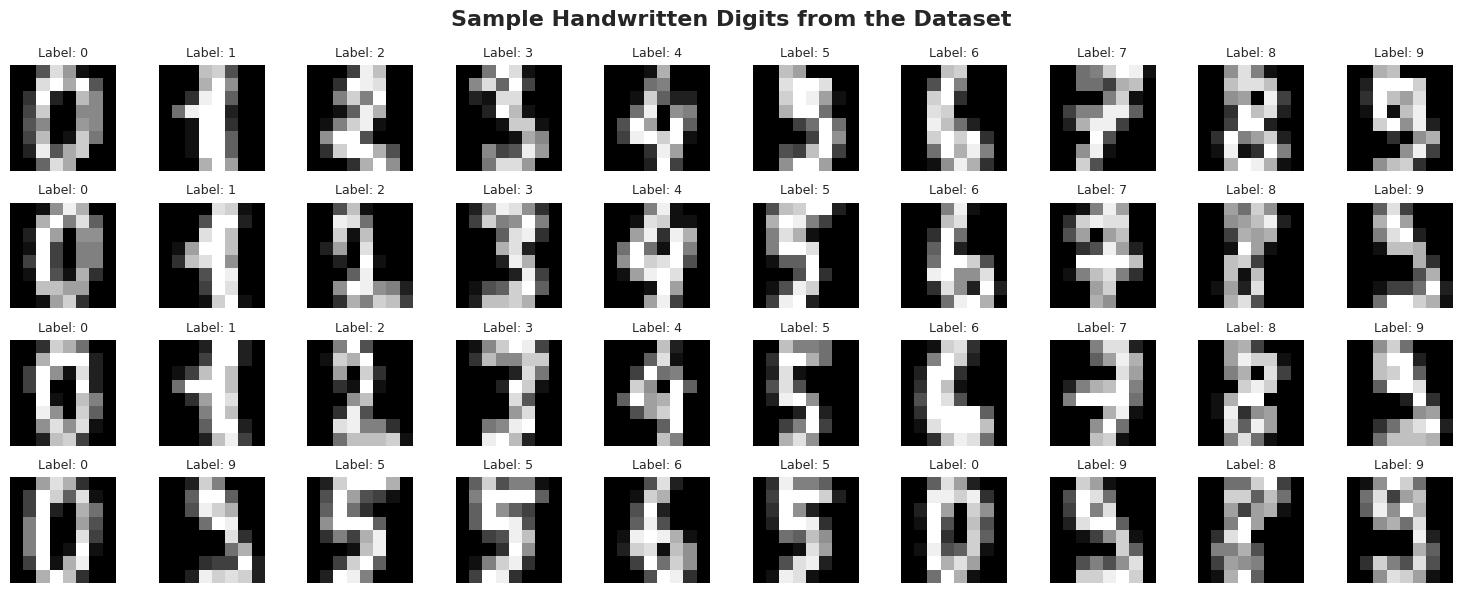
We'll use the Digits dataset from scikit-learn, which contains images of handwritten digits (0-9). Each image is 8×8 pixels, represented as 64 features (pixel intensities).
The challenge: Can K-Means discover the 10 digit classes without ever seeing labels?
1. Import Required Libraries
We'll need tools for data loading, preprocessing, clustering, evaluation, and visualization.
import numpy as np
import pandas as pd
import matplotlib.pyplot as plt
import seaborn as sns
from mpl_toolkits.mplot3d import Axes3D

# Scikit-learn imports
from sklearn.datasets import load_digits
from sklearn.preprocessing import StandardScaler
from sklearn.cluster import KMeans
from sklearn.pipeline import Pipeline
from sklearn.decomposition import PCA

# Clustering evaluation metrics
from sklearn.metrics import (
    silhouette_score,
    silhouette_samples,
    calinski_harabasz_score,
    davies_bouldin_score,
    adjusted_rand_score,
    normalized_mutual_info_score,
    homogeneity_score,
    completeness_score,
    v_measure_score
)

# Visualization settings
sns.set_style("whitegrid")
plt.rcParams['figure.dpi'] = 100
2. Load and Explore the Digits Dataset
The Digits dataset contains 1,797 images of handwritten digits (0-9), each represented as an 8×8 pixel grid (64 features total). Each pixel value ranges from 0 (white) to 16 (black).
Dataset Characteristics
- Samples: 1,797 handwritten digit images
- Features: 64 (8×8 pixel intensities)
- Classes: 10 (digits 0-9)
- Feature range: 0-16 (grayscale intensity)
Important: Although this dataset has labels, we'll use them ONLY for evaluation. The clustering algorithm will not see the labels during training (that's what makes it unsupervised!).
digits = load_digits() # Load the Digits dataset
X = digits.data  # 64 features (8x8 pixels)
y_true = digits.target  # True labels (for evaluation only!)

print(f"Dataset shape: {X.shape[0]:,} images, {X.shape[1]} features (8×8 pixels)")
print(f"Classes: {len(np.unique(y_true))} digits (0-9)")
print(f"Feature range: [{X.min():.0f}, {X.max():.0f}] (pixel intensity)")

# Visualize sample digits
fig, axes = plt.subplots(4, 10, figsize=(15, 6))
fig.suptitle('Sample Handwritten Digits from the Dataset', fontsize=16, fontweight='bold')

for i, ax in enumerate(axes.flat):
    if i < len(X):
        # Reshape 64 features back to 8x8 image
        image = X[i].reshape(8, 8)
        ax.imshow(image, cmap='gray')
        ax.set_title(f'Label: {y_true[i]}', fontsize=9)
    ax.axis('off')

plt.tight_layout()
plt.show()
Dataset shape: 1,797 images, 64 features (8×8 pixels) Classes: 10 digits (0-9) Feature range: [0, 16] (pixel intensity)
# Display the distribution of samples across the 10 digit classes
unique_classes, class_counts = np.unique(y_true, return_counts=True)

print("Distribution of samples per digit class:")
print(f"{'Digit':<8} {'Count':>8} {'Percentage':>12}")
print("-" * 30)

for digit, count in zip(unique_classes, class_counts):
    percentage = (count / len(y_true)) * 100
    bar = '█' * (count // 10)
    print(f"{digit:<8} {count:>8} ({percentage:>6.2f}%)  {bar}")

print("-" * 30)
print(f"{'Total':<8} {len(y_true):>8} ({100.0:>6.2f}%)")
Distribution of samples per digit class: Digit Count Percentage ------------------------------ 0 178 ( 9.91%) █████████████████ 1 182 ( 10.13%) ██████████████████ 2 177 ( 9.85%) █████████████████ 3 183 ( 10.18%) ██████████████████ 4 181 ( 10.07%) ██████████████████ 5 182 ( 10.13%) ██████████████████ 6 181 ( 10.07%) ██████████████████ 7 179 ( 9.96%) █████████████████ 8 174 ( 9.68%) █████████████████ 9 180 ( 10.02%) ██████████████████ ------------------------------ Total 1797 (100.00%)
Feature Scaling Demonstration
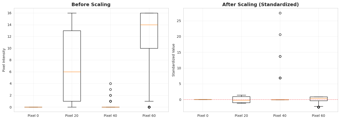
Before proceeding with clustering, we analyze the effect of feature scaling. K-Means relies on distance calculations (Euclidean distance), so it is critical that all features contribute equally.
In the following cell, we:
- Select a few example features (pixels).
- Compute and display their statistics (Mean, Std, Min, Max) before scaling, observing that raw pixel values can vary significantly.
- Apply
StandardScalerto transform the data. - Compute statistics after scaling, confirming that all features now have mean 0 and standard deviation 1.
- Visualize the distributions using boxplots to verify the normalization.
# Compare a few features before and after scaling
selected_features = [0, 20, 40, 60]
feature_names = [f'Pixel {i}' for i in selected_features]

# Original statistics
print("\nBEFORE SCALING (Original Features):")
print(f"{'Feature':<12} {'Mean':>8} {'Std':>8} {'Min':>8} {'Max':>8}")
print("-" * 48)
for idx, name in zip(selected_features, feature_names):
    col = X[:, idx]
    print(f"{name:<12} {col.mean():8.2f} {col.std():8.2f} {col.min():8.2f} {col.max():8.2f}")

# Apply scaling
scaler_demo = StandardScaler()
X_scaled_demo = scaler_demo.fit_transform(X)

# Scaled statistics
print("\nAFTER SCALING (Standardized Features):")
print(f"{'Feature':<12} {'Mean':>8} {'Std':>8} {'Min':>8} {'Max':>8}")
print("-" * 48)
for idx, name in zip(selected_features, feature_names):
    col = X_scaled_demo[:, idx]
    print(f"{name:<12} {col.mean():8.5f} {col.std():8.5f} {col.min():8.2f} {col.max():8.2f}")

print("\n✓ All features now have mean ≈ 0 and std ≈ 1")
print("✓ All features contribute equally to distance calculations")

# Visualize the scaling effect
fig, axes = plt.subplots(1, 2, figsize=(14, 5))

# Before scaling
axes[0].boxplot([X[:, idx] for idx in selected_features], tick_labels=feature_names)
axes[0].set_title('Before Scaling', fontsize=14, fontweight='bold')
axes[0].set_ylabel('Pixel Intensity')
axes[0].grid(True, alpha=0.3)

# After scaling
axes[1].boxplot([X_scaled_demo[:, idx] for idx in selected_features], tick_labels=feature_names)
axes[1].set_title('After Scaling (Standardized)', fontsize=14, fontweight='bold')
axes[1].set_ylabel('Standardized Value')
axes[1].grid(True, alpha=0.3)
axes[1].axhline(y=0, color='r', linestyle='--', linewidth=1, alpha=0.5)

plt.tight_layout()
plt.show()
BEFORE SCALING (Original Features): Feature Mean Std Min Max ------------------------------------------------ Pixel 0 0.00 0.00 0.00 0.00 Pixel 20 7.10 6.17 0.00 16.00 Pixel 40 0.01 0.15 0.00 4.00 Pixel 60 11.81 4.93 0.00 16.00 AFTER SCALING (Standardized Features): Feature Mean Std Min Max ------------------------------------------------ Pixel 0 0.00000 0.00000 0.00 0.00 Pixel 20 0.00000 1.00000 -1.15 1.44 Pixel 40 -0.00000 1.00000 -0.06 27.50 Pixel 60 0.00000 1.00000 -2.39 0.85 ✓ All features now have mean ≈ 0 and std ≈ 1 ✓ All features contribute equally to distance calculations
Interpretation of Results
1. Statistics Output:
- Before Scaling: You can see that different pixels have very different statistics (some might range 0-255, others might be mostly dark). If we used raw data, the distance calculations would be biased towards features with larger numerical ranges.
- After Scaling: All selected features now have a Mean very close to and a Standard Deviation of . This ensures that each pixel contributes equally to the similarity measures.
2. Boxplot Visualization: The plot above visualizes the distribution of values for the selected pixels.
- The Box represents the Interquartile Range (IQR), containing the middle 50% of the data (from the 25th to 75th percentile).
- The Line inside the box is the Median (50th percentile).
- The Whiskers extend to the most extreme data points not considered outliers (typically ).
- Outliers (individual points) are values that fall beyond the whiskers.
Notice how in the After Scaling plot, the boxes are all aligned around the red dashed line () and have similar sizes. This confirms that the data is essentially centered and scaled, ready for clustering.
4. Build and Train the Clustering Pipeline
Now we'll create a pipeline that combines preprocessing and clustering. We'll use K=10 clusters since we know there are 10 digits (though the algorithm doesn't know this!).
Pipeline Definition and Training
- StandardScaler: Ensures all features contribute equally
- KMeans: Finds K cluster centers that minimize within-cluster variance
K-Means Parameters:
n_clusters=10: Number of clusters to findrandom_state=42: For reproducibility (K-Means has random initialization)n_init=10: Number of times to run K-Means with different initializations (keeps best result)max_iter=300: Maximum iterations before stopping
Important: We choose K=10 because we know there are 10 digits. In real unsupervised scenarios, choosing K is a challenge we'll address later.
pipeline = Pipeline([
    ('scaler', StandardScaler()),
    ('kmeans', KMeans(
        n_clusters=10,       # We want 10 clusters (one per digit)
        random_state=42,     # For reproducibility
        n_init=10,           # Run 10 times with different initializations
        max_iter=300         # Maximum iterations per run
    ))
])
pipeline
Pipeline(steps=[('scaler', StandardScaler()),
('kmeans', KMeans(n_clusters=10, n_init=10, random_state=42))])We fit the pipeline to the data. This scales the data and performs K-Means clustering.
pipeline.fit(X)Pipeline(steps=[('scaler', StandardScaler()),
('kmeans', KMeans(n_clusters=10, n_init=10, random_state=42))])Training Statistics
Let's examine the clustering results:
- Inertia: Sum of squared distances of samples to their closest cluster center. Lower is generally better (tighter clusters), but inertia decreases as K increases, so it must be interpreted with caution.
- Cluster Sizes: We check if the clusters are relatively balanced or if some are empty/tiny.
# Access the trained components
scaler = pipeline.named_steps['scaler']
kmeans = pipeline.named_steps['kmeans']

# Get cluster assignments
labels_pred = kmeans.labels_

print(f"Number of clusters: {kmeans.n_clusters}")
print(f"Number of iterations: {kmeans.n_iter_}")
print(f"Final inertia (sum of squared distances to centers): {kmeans.inertia_:.2f}")

# Show cluster sizes
unique_labels, counts = np.unique(labels_pred, return_counts=True)
for cluster_id, count in zip(unique_labels, counts):
    bar = '█' * (count // 10)
    print(f"Cluster {cluster_id}: {count:3d} samples {bar}")
Number of clusters: 10 Number of iterations: 32 Final inertia (sum of squared distances to centers): 69813.56 Cluster 0: 245 samples ████████████████████████ Cluster 1: 156 samples ███████████████ Cluster 2: 177 samples █████████████████ Cluster 3: 71 samples ███████ Cluster 4: 232 samples ███████████████████████ Cluster 5: 179 samples █████████████████ Cluster 6: 127 samples ████████████ Cluster 7: 183 samples ██████████████████ Cluster 8: 397 samples ███████████████████████████████████████ Cluster 9: 30 samples ███
Interpretation of Training Results
1. Iterations: The algorithm converged in 32 iterations (well below the default limit of 300).
- Convergence Criteria: K-Means stops iterating when the cluster centers move less than a specific threshold (tolerance
tol=1e-4by default) between consecutive steps. - Meaning: Converging in 32 iterations means the centroids stabilized quickly and found a local minimum without needing to be force-stopped by
max_iter.
2. Inertia (69,813.56): Is this good or bad? To understand this number, we compare it to the total variation in the dataset:
- Total Variance (Total Sum of Squares): Since we standardized the data, every feature (pixel) has a variance of . With samples and features, the maximum possible inertia (if we had just 1 cluster) would be .
- Inertia (Within-Cluster Variance): This is the "noise" or variation left inside the clusters. A value of means that of the total variation is still inside the clusters ().
- Explained Variance: The clustering structure explains the remaining of the variation. This represents how well separated the 10 groups are.
Conclusion: Recovering 40% of the structure with just 10 simple centers is reasonable for high-dimensional handwritten digits, where much of the variation comes from individual handwriting styles (slant, thickness) rather than just the digit identity.
3. Cluster Sizes: We see that all clusters have a significant number of samples (none are empty). This suggests the algorithm didn't get stuck in a trivial local minimum and found a balanced partition.
4.3. Visualizing Cluster Centers
Since we are in a 64-dimensional space, we can visualize the cluster centers (centroids) to understand what each cluster represents.
Because we used StandardScaler, the centroids are in the scaled space. We use scaler.inverse_transform to map them back to the original pixel intensity space (0-16) and reshape them into 8x8 images.
Ideally, each centroid should look like a clear digit.
# Visualize cluster centers as digit images
fig, axes = plt.subplots(2, 5, figsize=(12, 5))
fig.suptitle('K-Means Cluster Centers (Average Digit in Each Cluster)', fontsize=14, fontweight='bold')

# Get cluster centers in original space (inverse transform from scaled space)
centers_scaled = kmeans.cluster_centers_
centers_original = scaler.inverse_transform(centers_scaled)

for i, ax in enumerate(axes.flat):
    # Reshape center to 8x8 image
    center_image = centers_original[i].reshape(8, 8)
    ax.imshow(center_image, cmap='gray')
    ax.set_title(f'Cluster {i}\n({counts[i]} samples)', fontsize=10)
    ax.axis('off')

plt.tight_layout()
plt.show()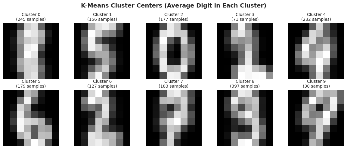
5. Evaluate Clustering Performance
Evaluating clustering is tricky because we don't have "correct" labels in true unsupervised scenarios. However, since we have true digit labels, we can use both unsupervised and supervised metrics.
Unsupervised Metrics (Ignoring True Labels)
These metrics evaluate cluster quality based solely on the geometry of clusters:
Silhouette Score (-1 to 1, higher is better):
- Measures how similar points are to their own cluster vs. other clusters
- Formula: where = avg distance to own cluster, = avg distance to nearest other cluster
Calinski-Harabasz Score (higher is better):
- Ratio of between-cluster dispersion to within-cluster dispersion
- Higher means clusters are dense and well-separated
Davies-Bouldin Score (lower is better):
- Average similarity between each cluster and its most similar cluster
- Lower means better separation
# Get scaled data for evaluation
X_scaled = scaler.transform(X)

# Compute unsupervised metrics
silhouette = silhouette_score(X_scaled, labels_pred)
calinski_harabasz = calinski_harabasz_score(X_scaled, labels_pred)
davies_bouldin = davies_bouldin_score(X_scaled, labels_pred)

print("\nThese metrics evaluate cluster quality without using true labels:\n")
print(f"Silhouette Score:        {silhouette:8.4f}  (Range: [-1, 1], higher is better)")
print(f"Calinski-Harabasz Score: {calinski_harabasz:8.2f}  (Higher is better)")
print(f"Davies-Bouldin Score:    {davies_bouldin:8.4f}  (Lower is better)")

# Interpret silhouette score
if silhouette > 0.5:
    interpretation = "Good cluster separation"
elif silhouette > 0.25:
    interpretation = "Moderate cluster structure"
else:
    interpretation = "Weak cluster structure"
print(f"\nSilhouette interpretation: {interpretation}")
These metrics evaluate cluster quality without using true labels: Silhouette Score: 0.1394 (Range: [-1, 1], higher is better) Calinski-Harabasz Score: 113.20 (Higher is better) Davies-Bouldin Score: 1.8770 (Lower is better) Silhouette interpretation: Weak cluster structure
Supervised Metrics (Use True Labels for Comparison)
Important: In real-world unsupervised clustering, we lack true labels and rely on intrinsic metrics (like Silhouette). We use external metrics (ARI, NMI) here for benchmarking purposes since the ground truth is available for this dataset.\n
These measure agreement between predicted clusters and true labels:
Adjusted Rand Index (-1 to 1, higher is better):
- Measures similarity between two clusterings, adjusted for chance
- 1 = perfect match, 0 = random, < 0 = worse than random
Normalized Mutual Information (0 to 1, higher is better):
- Measures mutual information between cluster labels and true labels
Homogeneity, Completeness, V-Measure:
- Homogeneity: Each cluster contains only members of a single class
- Completeness: All members of a class are in the same cluster
- V-Measure: Harmonic mean of homogeneity and completeness
# Compute supervised metrics (comparing with true labels)
ari = adjusted_rand_score(y_true, labels_pred)
nmi = normalized_mutual_info_score(y_true, labels_pred)
homogeneity = homogeneity_score(y_true, labels_pred)
completeness = completeness_score(y_true, labels_pred)
v_measure = v_measure_score(y_true, labels_pred)

print(f"Adjusted Rand Index (ARI):      {ari:8.4f}  (Range: [-1, 1], higher is better)")
print(f"Normalized Mutual Info (NMI):   {nmi:8.4f}  (Range: [0, 1], higher is better)")
print(f"Homogeneity:                    {homogeneity:8.4f}  (Each cluster = one digit)")
print(f"Completeness:                   {completeness:8.4f}  (Each digit = one cluster)")
print(f"V-Measure:                      {v_measure:8.4f}  (Harmonic mean)")
Adjusted Rand Index (ARI): 0.5344 (Range: [-1, 1], higher is better) Normalized Mutual Info (NMI): 0.6712 (Range: [0, 1], higher is better) Homogeneity: 0.6498 (Each cluster = one digit) Completeness: 0.6941 (Each digit = one cluster) V-Measure: 0.6712 (Harmonic mean)
Create a mapping from clusters to digits (which digit is most common in each cluster?)
print(f"✓ Clusters have {v_measure*100:.1f}% agreement with true digit labels")
print(f"✓ Average silhouette score of {silhouette:.3f} indicates reasonably separated clusters")
✓ Clusters have 67.1% agreement with true digit labels ✓ Average silhouette score of 0.139 indicates reasonably separated clusters
cluster_to_digit = {}
for cluster_id in range(10):
    # Get all true labels for this cluster
    mask = labels_pred == cluster_id
    true_labels_in_cluster = y_true[mask]

    # Find most common digit
    unique, counts = np.unique(true_labels_in_cluster, return_counts=True)
    most_common_digit = unique[np.argmax(counts)]
    purity = counts[np.argmax(counts)] / len(true_labels_in_cluster) * 100

    cluster_to_digit[cluster_id] = most_common_digit

    print(f"Cluster {cluster_id} → Digit {most_common_digit} (Purity: {purity:.1f}%)")

    # Show distribution of all digits in this cluster
    dist = " | ".join([f"{d}:{cnt}" for d, cnt in zip(unique, counts)])
    print(f"            Distribution: {dist}\n")
Cluster 0 → Digit 1 (Purity: 43.7%)
Distribution: 1:107 | 2:21 | 3:7 | 4:1 | 5:1 | 6:5 | 8:101 | 9:2
Cluster 1 → Digit 5 (Purity: 87.8%)
Distribution: 1:1 | 3:3 | 4:2 | 5:137 | 7:1 | 8:7 | 9:5
Cluster 2 → Digit 0 (Purity: 99.4%)
Distribution: 0:176 | 6:1
Cluster 3 → Digit 2 (Purity: 60.6%)
Distribution: 1:27 | 2:43 | 3:1
Cluster 4 → Digit 4 (Purity: 68.5%)
Distribution: 0:2 | 1:46 | 2:3 | 4:159 | 5:2 | 7:2 | 8:3 | 9:15
Cluster 5 → Digit 6 (Purity: 97.8%)
Distribution: 5:2 | 6:175 | 8:2
Cluster 6 → Digit 2 (Purity: 81.9%)
Distribution: 2:104 | 3:9 | 7:7 | 8:7
Cluster 7 → Digit 7 (Purity: 83.1%)
Distribution: 2:1 | 3:7 | 4:10 | 7:152 | 8:4 | 9:9
Cluster 8 → Digit 3 (Purity: 39.3%)
Distribution: 1:1 | 2:5 | 3:156 | 5:40 | 8:50 | 9:145
Cluster 9 → Digit 7 (Purity: 56.7%)
Distribution: 4:9 | 7:17 | 9:4
6. Visualize Clustering Results
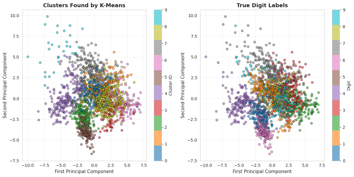
Since our data has 64 dimensions, we can't directly visualize it. We'll use PCA (Principal Component Analysis) to reduce it to 2D for visualization.
What is PCA?
PCA finds the directions (principal components) in which the data varies most. By projecting data onto the first 2-3 components, we can visualize high-dimensional data while preserving most of the variance.
Important: This is just for visualization. The actual clustering was performed in the full 64-dimensional space.
Visualization & Analysis
1. PCA Projection (Left & Middle)
- Points close together in 2D were also close in 64D space
- Some overlap is expected - we lost information projecting 64D → 2D
- Compare predicted clusters vs true labels to see agreement
# Apply PCA to reduce to 2D for visualization
pca = PCA(n_components=2)
X_pca = pca.fit_transform(X_scaled)

print(f"\nReduced {X.shape[1]} dimensions to 2 principal components")
print(f"Variance explained by PC1: {pca.explained_variance_ratio_[0]*100:.2f}%")
print(f"Variance explained by PC2: {pca.explained_variance_ratio_[1]*100:.2f}%")
print(f"Total variance explained: {sum(pca.explained_variance_ratio_)*100:.2f}%")

# Create visualization for Clusters vs True Labels
fig = plt.figure(figsize=(12, 6))

# Plot 1: Colored by predicted cluster
ax1 = fig.add_subplot(121)
scatter1 = ax1.scatter(X_pca[:, 0], X_pca[:, 1], c=labels_pred,
                       cmap='tab10', alpha=0.6, s=30, edgecolors='k', linewidth=0.5)
ax1.set_xlabel('First Principal Component', fontsize=11)
ax1.set_ylabel('Second Principal Component', fontsize=11)
ax1.set_title('Clusters Found by K-Means', fontsize=13, fontweight='bold')
ax1.grid(True, alpha=0.3)
cbar1 = plt.colorbar(scatter1, ax=ax1, ticks=range(10))
cbar1.set_label('Cluster ID', fontsize=10)

# Plot 2: Colored by true digit
ax2 = fig.add_subplot(122)
scatter2 = ax2.scatter(X_pca[:, 0], X_pca[:, 1], c=y_true,
                       cmap='tab10', alpha=0.6, s=30, edgecolors='k', linewidth=0.5)
ax2.set_xlabel('First Principal Component', fontsize=11)
ax2.set_ylabel('Second Principal Component', fontsize=11)
ax2.set_title('True Digit Labels', fontsize=13, fontweight='bold')
ax2.grid(True, alpha=0.3)
cbar2 = plt.colorbar(scatter2, ax=ax2, ticks=range(10))
cbar2.set_label('Digit', fontsize=10)

plt.tight_layout()
plt.show()
Reduced 64 dimensions to 2 principal components Variance explained by PC1: 12.03% Variance explained by PC2: 9.56% Total variance explained: 21.59%
2. Silhouette Plot (Right)
- Each horizontal bar = one sample, sorted by silhouette coefficient
- Wider bars above red line = well-clustered
- Thin or negative bars = possibly misclassified
- All clusters have positive average silhouette scores ✓
# Plot 3: Silhouette analysis
fig = plt.figure(figsize=(8, 6))
ax3 = fig.add_subplot(111)
silhouette_vals = silhouette_samples(X_scaled, labels_pred)
y_lower = 10

for i in range(10):
    cluster_silhouette_vals = silhouette_vals[labels_pred == i]
    cluster_silhouette_vals.sort()

    size_cluster_i = cluster_silhouette_vals.shape[0]
    y_upper = y_lower + size_cluster_i

    color = plt.cm.tab10(i / 10)
    ax3.fill_betweenx(np.arange(y_lower, y_upper), 0, cluster_silhouette_vals,
                      facecolor=color, edgecolor=color, alpha=0.7)

    ax3.text(-0.05, y_lower + 0.5 * size_cluster_i, str(i))
    y_lower = y_upper + 10

ax3.set_xlabel('Silhouette Coefficient', fontsize=11)
ax3.set_ylabel('Cluster', fontsize=11)
ax3.set_title('Silhouette Plot', fontsize=13, fontweight='bold')
ax3.axvline(x=silhouette, color="red", linestyle="--", linewidth=2, label=f'Mean: {silhouette:.3f}')
ax3.set_yticks([])
ax3.legend()
ax3.grid(True, alpha=0.3, axis='x')

plt.tight_layout()
plt.show()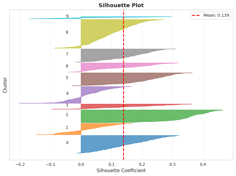
3. Sample Images
- Shows actual digit images from each cluster
- Most clusters contain predominantly one digit type
- Some confusion between similar-looking digits (e.g., 3 and 8, 4 and 9)
# Show sample images from each cluster
fig, axes = plt.subplots(10, 10, figsize=(15, 15))
fig.suptitle('Sample Images from Each Cluster (10 per cluster)', fontsize=16, fontweight='bold')

for cluster_id in range(10):
    # Get indices of images in this cluster
    cluster_indices = np.where(labels_pred == cluster_id)[0]

    # Sample up to 10 images
    sample_indices = np.random.choice(cluster_indices, min(10, len(cluster_indices)), replace=False)

    for i, img_idx in enumerate(sample_indices):
        ax = axes[cluster_id, i]
        image = X[img_idx].reshape(8, 8)
        ax.imshow(image, cmap='gray')
        ax.axis('off')

        if i == 0:
            # Map cluster to most common digit
            most_common = cluster_to_digit[cluster_id]
            ax.set_ylabel(f'Cluster {cluster_id}\n(→Digit {most_common})',
                         fontsize=10, fontweight='bold')

        # Add column labels on the top row
        if cluster_id == 0:
            ax.set_title(f'#{i+1}', fontsize=9, pad=5)

plt.tight_layout()
plt.show()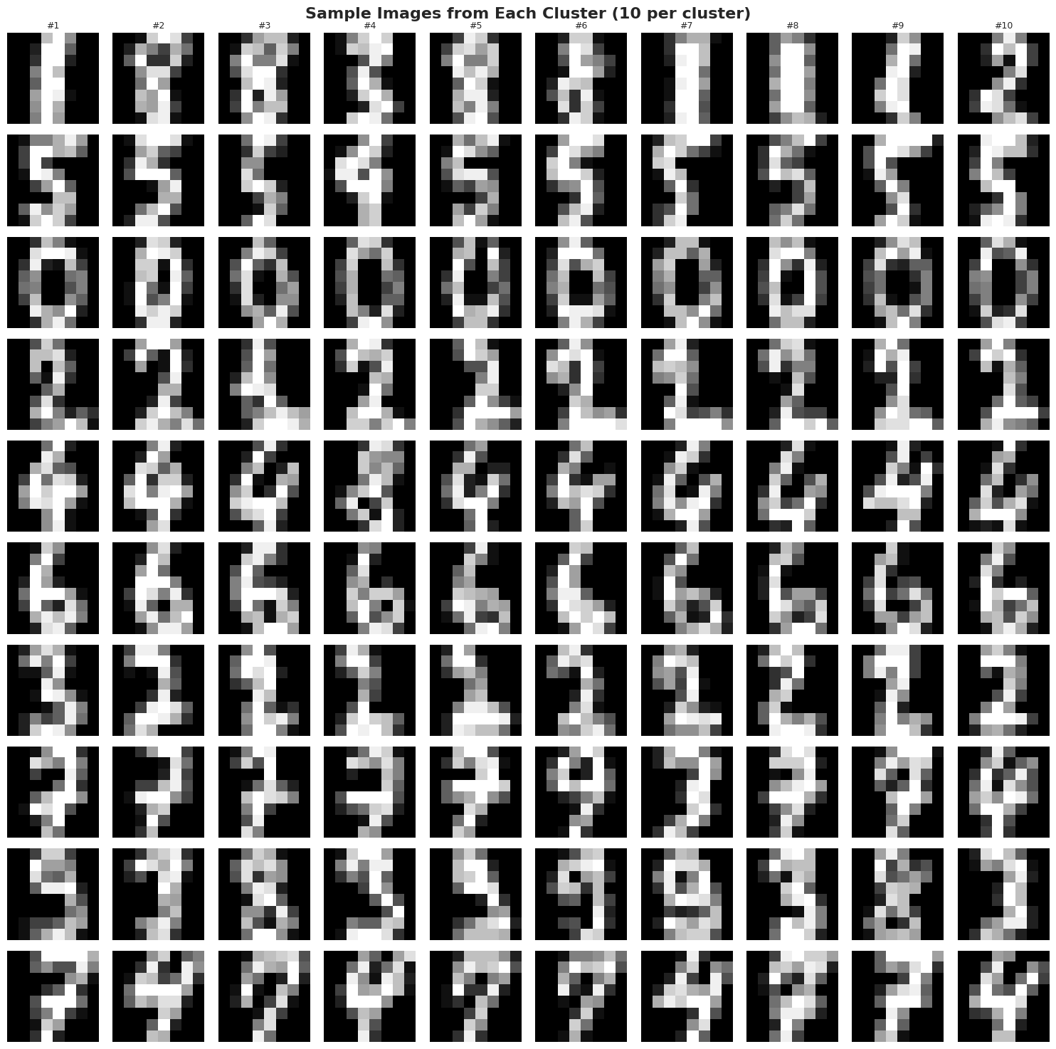
7. Choosing the Number of Clusters (K)
In our example, we knew K=10 because there are 10 digits. But what if we didn't know? Let's explore methods for choosing K.
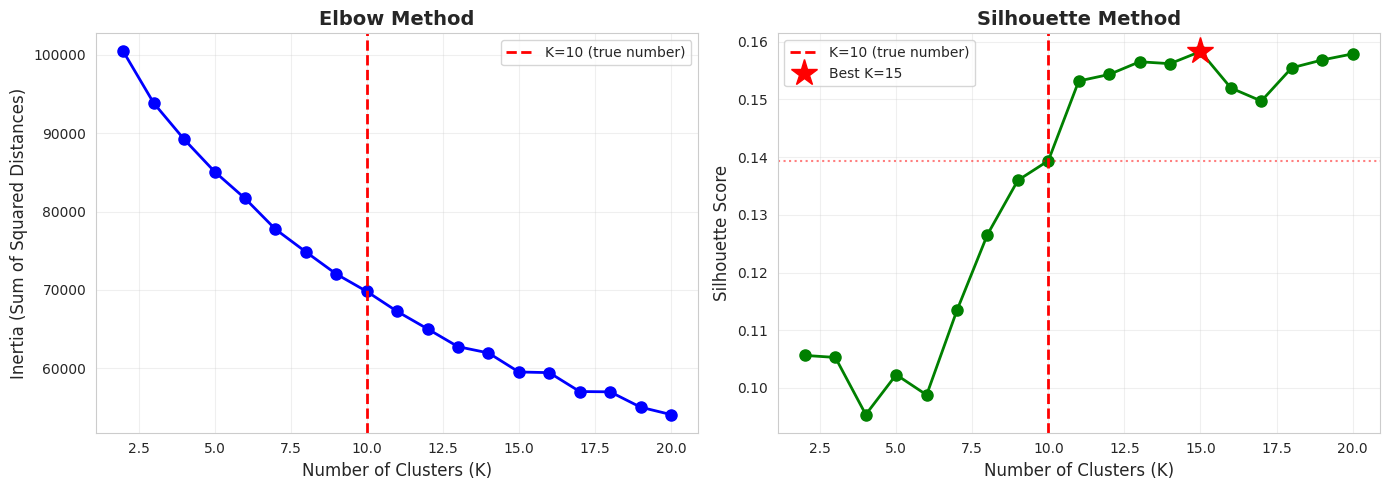
The Elbow Method
Plot the inertia (sum of squared distances to cluster centers) for different values of K. Look for an "elbow" where the rate of decrease sharply changes.
Silhouette Method
Plot the silhouette score for different K values. Choose K that maximizes the silhouette score.
Let's try both methods:
# Test different numbers of clusters
K_range = range(2, 21)
inertias = []
silhouettes = []

print("=" * 80)
print("=" * 80)
print("\nThis may take a minute...\n")

for k in K_range:
    # Create pipeline with k clusters
    pipeline_k = Pipeline([
        ('scaler', StandardScaler()),
        ('kmeans', KMeans(n_clusters=k, random_state=42, n_init=10))
    ])

    # Fit and evaluate
    pipeline_k.fit(X)
    labels_k = pipeline_k.named_steps['kmeans'].labels_
    X_scaled_k = pipeline_k.named_steps['scaler'].transform(X)

    inertias.append(pipeline_k.named_steps['kmeans'].inertia_)
    silhouettes.append(silhouette_score(X_scaled_k, labels_k))

    print(f"K={k:2d} | Inertia: {inertias[-1]:10,.2f} | Silhouette: {silhouettes[-1]:.4f}")

print("\n✓ Evaluation complete!")

# Visualize results
fig, axes = plt.subplots(1, 2, figsize=(14, 5))

# Elbow plot
axes[0].plot(K_range, inertias, 'bo-', linewidth=2, markersize=8)
axes[0].axvline(x=10, color='r', linestyle='--', linewidth=2, label='K=10 (true number)')
axes[0].set_xlabel('Number of Clusters (K)', fontsize=12)
axes[0].set_ylabel('Inertia (Sum of Squared Distances)', fontsize=12)
axes[0].set_title('Elbow Method', fontsize=14, fontweight='bold')
axes[0].grid(True, alpha=0.3)
axes[0].legend()

# Silhouette plot
axes[1].plot(K_range, silhouettes, 'go-', linewidth=2, markersize=8)
axes[1].axvline(x=10, color='r', linestyle='--', linewidth=2, label='K=10 (true number)')
axes[1].axhline(y=silhouettes[K_range.index(10)], color='r', linestyle=':', alpha=0.5)
axes[1].set_xlabel('Number of Clusters (K)', fontsize=12)
axes[1].set_ylabel('Silhouette Score', fontsize=12)
axes[1].set_title('Silhouette Method', fontsize=14, fontweight='bold')
axes[1].grid(True, alpha=0.3)
axes[1].legend()

# Mark the maximum silhouette score
best_k = K_range[np.argmax(silhouettes)]
axes[1].plot(best_k, max(silhouettes), 'r*', markersize=20, label=f'Best K={best_k}')
axes[1].legend()

plt.tight_layout()
plt.show()

print("\n" + "=" * 80)
print("=" * 80)
print(f"\nBest K by silhouette score: {best_k}")
print(f"True number of digits: 10")
print(f"\nElbow method:")
print("  Look for where the curve 'bends' - rate of decrease slows")
print(f"  Elbow appears around K=8-10")
print(f"\nSilhouette method:")
print(f"  Maximum silhouette at K={best_k}: {max(silhouettes):.4f}")
print(f"  Silhouette at K=10: {silhouettes[K_range.index(10)]:.4f}")

print("\n✓ Both methods suggest K around 8-12, confirming our choice of K=10!")
================================================================================ ================================================================================ This may take a minute... K= 2 | Inertia: 100,423.84 | Silhouette: 0.1056 K= 3 | Inertia: 93,842.48 | Silhouette: 0.1053 K= 4 | Inertia: 89,213.97 | Silhouette: 0.0954 K= 5 | Inertia: 85,096.05 | Silhouette: 0.1023 K= 6 | Inertia: 81,678.47 | Silhouette: 0.0988 K= 7 | Inertia: 77,749.33 | Silhouette: 0.1135 K= 8 | Inertia: 74,854.16 | Silhouette: 0.1266 K= 9 | Inertia: 72,029.73 | Silhouette: 0.1360 K=10 | Inertia: 69,813.56 | Silhouette: 0.1394 K=11 | Inertia: 67,261.85 | Silhouette: 0.1532 K=12 | Inertia: 65,031.72 | Silhouette: 0.1543 K=13 | Inertia: 62,763.18 | Silhouette: 0.1565 K=14 | Inertia: 61,963.42 | Silhouette: 0.1562 K=15 | Inertia: 59,534.50 | Silhouette: 0.1583 K=16 | Inertia: 59,448.73 | Silhouette: 0.1520 K=17 | Inertia: 57,038.16 | Silhouette: 0.1497 K=18 | Inertia: 57,000.79 | Silhouette: 0.1555 K=19 | Inertia: 55,043.49 | Silhouette: 0.1568 K=20 | Inertia: 54,099.96 | Silhouette: 0.1579 ✓ Evaluation complete!
================================================================================
================================================================================

Best K by silhouette score: 15
True number of digits: 10

Elbow method:
  Look for where the curve 'bends' - rate of decrease slows
  Elbow appears around K=8-10

Silhouette method:
  Maximum silhouette at K=15: 0.1583
  Silhouette at K=10: 0.1394

✓ Both methods suggest K around 8-12, confirming our choice of K=10!
8. Key Takeaways
What We Learned
-
Unsupervised Learning: K-Means discovered digit groupings without ever seeing labels, achieving significant agreement with true classes.
-
Feature Scaling is Critical: K-Means uses Euclidean distance, so features must be on comparable scales. StandardScaler ensures equal contribution from all features.
-
Pipelines for Clustering: Even though clustering is unsupervised, pipelines still provide benefits: clean code, no data leakage in preprocessing, and easy experimentation.
-
Multiple Evaluation Metrics: Used both unsupervised metrics (silhouette, inertia) and supervised metrics (ARI, NMI) to understand performance from different angles.
-
Choosing K is Hard: In real scenarios without true labels, use elbow method, silhouette analysis, and domain knowledge to select K.
Limitations of K-Means
- Must specify K: Need to know or guess the number of clusters
- Assumes spherical clusters: Struggles with elongated or irregular shapes
- Sensitive to initialization: Different random starts can give different results (mitigated by
n_init) - Sensitive to outliers: Outliers can distort cluster centers
- Equal variance assumption: Assumes clusters have similar sizes and densities
When to Use K-Means
Good for:
- Large datasets (efficient algorithm)
- Roughly spherical, well-separated clusters
- When you have a reasonable estimate for K
- Initial exploratory analysis
Consider alternatives for:
- Unknown number of clusters → Try DBSCAN or Hierarchical Clustering
- Non-spherical clusters → Try DBSCAN or Spectral Clustering
- Different cluster densities → Try DBSCAN
- Outlier sensitivity → Try DBSCAN or robust variations
Best Practices Demonstrated
✓ Always scale features before K-Means
✓ Use pipelines to ensure consistent preprocessing
✓ Try multiple values of K and compare metrics
✓ Visualize results (even high-dimensional data via PCA)
✓ Use multiple evaluation metrics
✓ Examine cluster contents to verify meaningful groupings
✓ Set random_state for reproducibility
✓ Use n_init > 1 to find best initialization