Basic Regression Workflow with Linear Regression
En esta página
- Introduction
- What is Regression?
- The Complete ML Workflow
- Dataset: California Housing
- 1. Import Required Libraries
- 2. Load and Explore the Dataset
- Dataset Features
- Load the Dataset
- Examine the First Rows
- Statistical Summary
- Key Observations
- Target Variable Distribution
- Visualize Target Distribution
- Feature Correlations
- 3. Split Data into Training and Testing Sets
- Why Split?
- The Danger of Not Splitting
- 4. Preprocess: Feature Scaling
- Why Scale Features?
- StandardScaler: The Solution
- Step 1: Create and Fit the Scaler
- Step 2: Transform Training Data
- Step 3: Transform Test Data
- 5. Train the Linear Regression Model
- How Linear Regression Works
- Interpreting Model Coefficients
- 6. Make Predictions
- 7. Evaluate Model Performance
- Regression Metrics
- Understanding Overfitting
- 8. Visualize Results
- Actual vs Predicted Values
- Error Distribution
- 9. Key Takeaways
- What We Learned
- Linear Regression Strengths
- Linear Regression Limitations
- What's Next?
- Best Practices Checklist
Introduction
This notebook introduces the fundamental machine learning workflow for regression tasks using the simplest algorithm: Linear Regression. Our goal is to understand each step thoroughly before adding more complexity.
What is Regression?
Regression is a supervised learning task where we predict a continuous numerical value (not discrete categories). Examples:
- Predicting house prices based on features
- Forecasting temperature or energy consumption
- Estimating patient recovery time
The Complete ML Workflow
Every machine learning project follows these essential steps:
- Load and explore data: Understand what we're working with
- Split data: Separate training and testing sets
- Preprocess data: Scale features for better performance
- Train model: Fit the algorithm to training data
- Evaluate model: Assess performance on test data
- Analyze results: Understand predictions and errors
Dataset: California Housing
We'll use the California Housing dataset:
- 20,640 observations from 1990 California census
- 8 features: median income, house age, rooms, location, etc.
- Target: Median house value (in $100,000s)
1. Import Required Libraries
We'll import only what we need for this basic workflow.
import numpy as np
import pandas as pd
import matplotlib.pyplot as plt

# Scikit-learn imports
from sklearn.datasets import fetch_california_housing
from sklearn.model_selection import train_test_split
from sklearn.preprocessing import StandardScaler
from sklearn.linear_model import LinearRegression

# Evaluation metrics
from sklearn.metrics import (
    mean_absolute_error,
    root_mean_squared_error,
    r2_score
)
2. Load and Explore the Dataset
Dataset Features
The California Housing dataset contains these 8 features:
- MedInc: Median income in block group (in $10,000s)
- HouseAge: Median house age in block group (years)
- AveRooms: Average number of rooms per household
- AveBedrms: Average number of bedrooms per household
- Population: Block group population
- AveOccup: Average household size (persons per household)
- Latitude: Block group latitude
- Longitude: Block group longitude
Target: Median house value (in $100,000s)
Load the Dataset
The fetch_california_housing() function loads the dataset. By setting as_frame=True, we get pandas DataFrames instead of NumPy arrays.
housing_data = fetch_california_housing(as_frame=True)
df = housing_data.frame
X = housing_data.data  # Features
y = housing_data.target  # Target (house values)

print(f"Shape: {X.shape[0]:,} observations, {X.shape[1]} features")
Shape: 20,640 observations, 8 features
Examine the First Rows
Let's look at the first few observations to understand the data structure.
df.head()| MedInc | HouseAge | AveRooms | AveBedrms | Population | AveOccup | Latitude | Longitude | MedHouseVal | |
|---|---|---|---|---|---|---|---|---|---|
| 0 | 8.3252 | 41.0 | 6.984127 | 1.023810 | 322.0 | 2.555556 | 37.88 | -122.23 | 4.526 |
| 1 | 8.3014 | 21.0 | 6.238137 | 0.971880 | 2401.0 | 2.109842 | 37.86 | -122.22 | 3.585 |
| 2 | 7.2574 | 52.0 | 8.288136 | 1.073446 | 496.0 | 2.802260 | 37.85 | -122.24 | 3.521 |
| 3 | 5.6431 | 52.0 | 5.817352 | 1.073059 | 558.0 | 2.547945 | 37.85 | -122.25 | 3.413 |
| 4 | 3.8462 | 52.0 | 6.281853 | 1.081081 | 565.0 | 2.181467 | 37.85 | -122.25 | 3.422 |
Statistical Summary
The describe() method shows key statistics: mean, standard deviation, min, quartiles, and max values for each feature.
df.describe().round(2)| MedInc | HouseAge | AveRooms | AveBedrms | Population | AveOccup | Latitude | Longitude | MedHouseVal | |
|---|---|---|---|---|---|---|---|---|---|
| count | 20640.00 | 20640.00 | 20640.00 | 20640.00 | 20640.00 | 20640.00 | 20640.00 | 20640.00 | 20640.00 |
| mean | 3.87 | 28.64 | 5.43 | 1.10 | 1425.48 | 3.07 | 35.63 | -119.57 | 2.07 |
| std | 1.90 | 12.59 | 2.47 | 0.47 | 1132.46 | 10.39 | 2.14 | 2.00 | 1.15 |
| min | 0.50 | 1.00 | 0.85 | 0.33 | 3.00 | 0.69 | 32.54 | -124.35 | 0.15 |
| 25% | 2.56 | 18.00 | 4.44 | 1.01 | 787.00 | 2.43 | 33.93 | -121.80 | 1.20 |
| 50% | 3.53 | 29.00 | 5.23 | 1.05 | 1166.00 | 2.82 | 34.26 | -118.49 | 1.80 |
| 75% | 4.74 | 37.00 | 6.05 | 1.10 | 1725.00 | 3.28 | 37.71 | -118.01 | 2.65 |
| max | 15.00 | 52.00 | 141.91 | 34.07 | 35682.00 | 1243.33 | 41.95 | -114.31 | 5.00 |
Key Observations
Notice the different scales:
MedIncranges from ~0.5 to 15Populationranges from 3 to 35,000+Latituderanges from 32 to 42
These vastly different scales will require feature scaling before training.
Target Variable Distribution
Let's examine the target variable (house prices) more carefully.
print("\nTarget Variable Statistics (Median House Value):")
print(f"Mean:   ${y.mean() * 100000:,.0f}")
print(f"Median: ${y.median() * 100000:,.0f}")
print(f"Min:    ${y.min() * 100000:,.0f}")
print(f"Max:    ${y.max() * 100000:,.0f}")
print(f"Std:    ${y.std() * 100000:,.0f}")
Target Variable Statistics (Median House Value): Mean: $206,856 Median: $179,700 Min: $14,999 Max: $500,001 Std: $115,396
Visualize Target Distribution
Understanding the distribution of house prices helps us interpret model performance later.
plt.figure(figsize=(10, 5))

plt.subplot(1, 2, 1)
plt.hist(y, bins=50, edgecolor='black', alpha=0.7)
plt.xlabel('Median House Value ($100,000s)')
plt.ylabel('Frequency')
plt.title('Distribution of House Prices')
plt.grid(True, alpha=0.3)

plt.subplot(1, 2, 2)
plt.boxplot(y)
plt.ylabel('Median House Value ($100,000s)')
plt.title('House Price Boxplot')
plt.grid(True, alpha=0.3)

plt.tight_layout()
plt.show()

print("Notice: Prices are capped at $500,000 (value of 5.0)")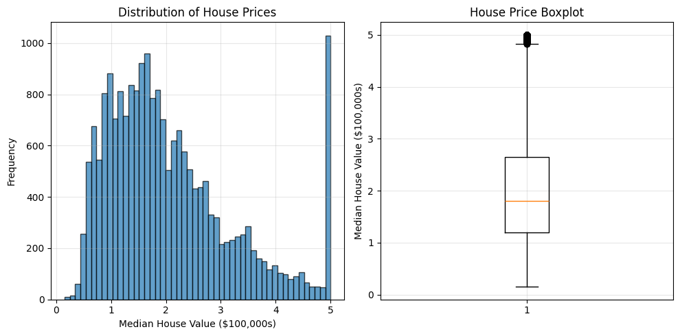
Notice: Prices are capped at $500,000 (value of 5.0)
Feature Correlations
Which features have the strongest relationship with house prices?
print("\nCorrelations with House Price (sorted by strength):")
print("=" * 60)

correlations = df.corr()['MedHouseVal'].sort_values(ascending=False).drop('MedHouseVal')

for feature, corr in correlations.items():
    bar = '█' * int(abs(corr) * 40)
    sign = '+' if corr > 0 else '-'
    print(f"{feature:12s}: {sign}{bar} {corr:6.3f}")

print("\nKey insight: Median income has the strongest correlation!")
Correlations with House Price (sorted by strength): ============================================================ MedInc : +███████████████████████████ 0.688 AveRooms : +██████ 0.152 HouseAge : +████ 0.106 AveOccup : - -0.024 Population : - -0.025 Longitude : -█ -0.046 AveBedrms : -█ -0.047 Latitude : -█████ -0.144 Key insight: Median income has the strongest correlation!
3. Split Data into Training and Testing Sets
Why Split?
This is the most fundamental principle in machine learning:
- Training Set (80%): Used to teach the model
- Test Set (20%): Used to evaluate the model on unseen data
Critical Rule: The model must NEVER see the test set during training. This ensures our evaluation reflects real-world performance on new, unseen data.
The Danger of Not Splitting
If we train and evaluate on the same data:
- The model might just memorize the training data (overfitting)
- We'd have no idea how it performs on new data
- It's like studying for an exam with the exact questions that will appear
X_train, X_test, y_train, y_test = train_test_split(
    X, y,
    test_size=0.2,      # 20% for testing
    random_state=42     # For reproducibility
)

print("Data Split Summary:")
print("=" * 60)
print(f"Total observations:     {len(X):,}")
print(f"Training observations:  {len(X_train):,} ({len(X_train)/len(X)*100:.1f}%)")
print(f"Test observations:      {len(X_test):,} ({len(X_test)/len(X)*100:.1f}%)")

print(f"\nFeature shapes:")
print(f"  X_train: {X_train.shape}")
print(f"  X_test:  {X_test.shape}")

print(f"\nTarget distributions are similar:")
print(f"  Train mean: ${y_train.mean()*100000:,.0f}")
print(f"  Test mean:  ${y_test.mean()*100000:,.0f}")
print("\n✓ Good split! Distributions match.")
Data Split Summary: ============================================================ Total observations: 20,640 Training observations: 16,512 (80.0%) Test observations: 4,128 (20.0%) Feature shapes: X_train: (16512, 8) X_test: (4128, 8) Target distributions are similar: Train mean: $207,195 Test mean: $205,500 ✓ Good split! Distributions match.
4. Preprocess: Feature Scaling
Why Scale Features?
Standard Linear Regression uses a direct analytical solution (closed-form formula) rather than iterative optimization like Gradient Descent. This means it can technically find the optimal weights without scaling.
However, scaling is still best practice here for:
-
Coefficient Interpretation:
MedInc: ranges 0-15Population: ranges 3-35,000
Without scaling, the learned coefficients would be on vastly different scales, making it impossible to compare which feature is more "important" just by looking at the weights.
-
Numerical Stability: It prevents errors when working with very large or very small numbers.
-
Future-Proofing: It prepares our data for other algorithms (like SGD, SVMs, or Neural Networks) that strictly require scaling to converge.
StandardScaler: The Solution
StandardScaler transforms each feature to have:
- Mean = 0
- Standard deviation = 1
Formula:
where:
- = original value
- = mean (from training data)
- = standard deviation (from training data)
Step 1: Create and Fit the Scaler
We create a scaler and fit it on training data only. This calculates the mean and standard deviation for each feature.
# Create the scaler
scaler = StandardScaler()

# Fit on training data (learns mean and std)
scaler.fit(X_train)

print("Scaler fitted on training data!")
print("\nLearned parameters (first 3 features):")
for i in range(3):
    feature = housing_data.feature_names[i]
    mean = scaler.mean_[i]
    std = scaler.scale_[i]
    print(f"  {feature:10s}: mean = {mean:6.2f}, std = {std:5.2f}")
Scaler fitted on training data! Learned parameters (first 3 features): MedInc : mean = 3.88, std = 1.90 HouseAge : mean = 28.61, std = 12.60 AveRooms : mean = 5.44, std = 2.39
Step 2: Transform Training Data
Now we apply the scaling transformation to the training data.
# Transform training data
X_train_scaled = scaler.transform(X_train)

print("Training data scaled!")
print(f"Shape: {X_train_scaled.shape}")
print(f"\nAfter scaling, each feature has:")
print(f"  Mean ≈ 0.0: {X_train_scaled.mean():.6f}")
print(f"  Std ≈ 1.0:  {X_train_scaled.std():.6f}")
Training data scaled! Shape: (16512, 8) After scaling, each feature has: Mean ≈ 0.0: 0.000000 Std ≈ 1.0: 1.000000
Step 3: Transform Test Data
Critical Rule: We must use the same mean and std (from training data) to transform the test set.
Why?
- In production, new data arrives with no labels
- We can't compute statistics from unlabeled data
- We must use the training statistics we already learned
What NOT to do: Never call scaler.fit(X_test) — this would leak test information!
# Transform test data using training statistics
X_test_scaled = scaler.transform(X_test)  # Note: transform only, NOT fit_transform!

print("Test data scaled using training statistics!")
print(f"Shape: {X_test_scaled.shape}")
print("\n⚠ Important: We used training mean/std, not test mean/std")
print("   This prevents data leakage and simulates real deployment.")
Test data scaled using training statistics! Shape: (4128, 8) ⚠ Important: We used training mean/std, not test mean/std This prevents data leakage and simulates real deployment.
5. Train the Linear Regression Model
How Linear Regression Works
Linear Regression finds the best-fitting hyperplane through the data:
where:
- = predicted house value
- = intercept (baseline value)
- = coefficients (feature weights)
- = feature values (scaled)
The algorithm minimizes the sum of squared errors between predictions and actual values.
model = LinearRegression()
model.fit(X_train_scaled, y_train)

print(f"\nModel learned {len(model.coef_)} coefficients (one per feature)")
print(f"Intercept: {model.intercept_:.4f}")
Model learned 8 coefficients (one per feature) Intercept: 2.0719
Interpreting Model Coefficients
Each coefficient shows how much the target changes when that feature increases by one standard deviation (since we scaled).
print("Feature Importance (Coefficients):")
print("=" * 60)

# Create a DataFrame for better visualization
coef_df = pd.DataFrame({
    'Feature': housing_data.feature_names,
    'Coefficient': model.coef_
}).sort_values('Coefficient', key=abs, ascending=False)

for _, row in coef_df.iterrows():
    feature = row['Feature']
    coef = row['Coefficient']
    sign = '+' if coef > 0 else '-'
    bar = '█' * int(abs(coef) * 10)
    print(f"{feature:12s}: {sign}{bar} {coef:7.4f}")

print("\nInterpretation: Median income has the strongest positive impact!")
Feature Importance (Coefficients): ============================================================ Latitude : -████████ -0.8969 Longitude : -████████ -0.8698 MedInc : +████████ 0.8544 AveBedrms : +███ 0.3393 AveRooms : -██ -0.2944 HouseAge : +█ 0.1225 AveOccup : - -0.0408 Population : - -0.0023 Interpretation: Median income has the strongest positive impact!
6. Make Predictions
Now we can use our trained model to predict house prices on the test set.
y_train_pred = model.predict(X_train_scaled)
y_test_pred = model.predict(X_test_scaled)

print(f"Generated {len(y_train_pred):,} predictions on training set")
print(f"Generated {len(y_test_pred):,} predictions on test set")

# Show some sample predictions
print("\nSample Predictions (first 5 test observations):")

sample_df = pd.DataFrame({
    'Actual': y_test.iloc[:5].values * 100000,
    'Predicted': y_test_pred[:5] * 100000,
    'Error': (y_test.iloc[:5].values - y_test_pred[:5]) * 100000
})

# Format as currency
sample_df['Actual'] = sample_df['Actual'].apply(lambda x: f"${x:,.0f}")
sample_df['Predicted'] = sample_df['Predicted'].apply(lambda x: f"${x:,.0f}")
sample_df['Error'] = sample_df['Error'].apply(lambda x: f"${x:,.0f}")

sample_df
Generated 16,512 predictions on training set Generated 4,128 predictions on test set Sample Predictions (first 5 test observations):
| Actual | Predicted | Error | |
|---|---|---|---|
| 0 | $47,700 | $71,912 | $-24,212 |
| 1 | $45,800 | $176,402 | $-130,602 |
| 2 | $500,001 | $270,966 | $229,035 |
| 3 | $218,600 | $283,893 | $-65,293 |
| 4 | $278,000 | $260,466 | $17,534 |
7. Evaluate Model Performance
Regression Metrics
We'll use three standard metrics to evaluate our model:
-
Mean Absolute Error (MAE): Average prediction error
- Formula:
- Interpretation: Average error in dollars
-
Root Mean Squared Error (RMSE): Emphasizes larger errors
- Formula:
- Interpretation: Typical error magnitude
-
R² Score: Proportion of variance explained
- Formula:
- Range: where 1.0 is perfect
- Interpretation: How well the model explains the data
# Calculate metrics for training set
train_mae = mean_absolute_error(y_train, y_train_pred)
train_rmse = root_mean_squared_error(y_train, y_train_pred)
train_r2 = r2_score(y_train, y_train_pred)

# Calculate metrics for test set
test_mae = mean_absolute_error(y_test, y_test_pred)
test_rmse = root_mean_squared_error(y_test, y_test_pred)
test_r2 = r2_score(y_test, y_test_pred)

# Create performance metrics DataFrame
metrics_df = pd.DataFrame({
    'Metric': ['Mean Absolute Error', 'Root Mean Squared Error', 'R² Score'],
    'Training': [
        f"${train_mae*100000:,.0f}",
        f"${train_rmse*100000:,.0f}",
        f"{train_r2:.4f}"
    ],
    'Test': [
        f"${test_mae*100000:,.0f}",
        f"${test_rmse*100000:,.0f}",
        f"{test_r2:.4f}"
    ]
})

print("Model Performance Metrics:")
display(metrics_df)

print(f"\nInterpretation:")
print(f"  • On average, predictions are off by ${test_mae*100000:,.0f}")
print(f"  • The model explains {test_r2*100:.2f}% of variance in house prices")
print(f"  • Training and test metrics are similar → good generalization!")
Model Performance Metrics:
| Metric | Training | Test | |
|---|---|---|---|
| 0 | Mean Absolute Error | $52,863 | $53,320 |
| 1 | Root Mean Squared Error | $71,968 | $74,558 |
| 2 | R² Score | 0.6126 | 0.5758 |
Interpretation:
  • On average, predictions are off by $53,320
  • The model explains 57.58% of variance in house prices
  • Training and test metrics are similar → good generalization!
Understanding Overfitting
Overfitting occurs when a model performs much better on training data than test data.
Signs of overfitting:
- Large gap between training and test R²
- Training error << Test error
Our Linear Regression shows good generalization because training and test metrics are similar.
# Check for overfitting
r2_gap = train_r2 - test_r2

print("Overfitting Analysis:")
print("=" * 60)
print(f"Training R²:  {train_r2:.4f}")
print(f"Test R²:      {test_r2:.4f}")
print(f"Gap:          {r2_gap:.4f}")

if r2_gap < 0.02:
    print("\n✓ Excellent! No overfitting detected.")
elif r2_gap < 0.05:
    print("\n✓ Good! Minimal overfitting.")
elif r2_gap < 0.10:
    print("\n⚠ Slight overfitting present.")
else:
    print("\n✗ Significant overfitting detected!")
Overfitting Analysis: ============================================================ Training R²: 0.6126 Test R²: 0.5758 Gap: 0.0368 ✓ Good! Minimal overfitting.
8. Visualize Results
Actual vs Predicted Values
This scatter plot shows how well predictions match actual values. Points on the diagonal line represent perfect predictions.
plt.figure(figsize=(10, 5))

# Actual vs Predicted
plt.subplot(1, 2, 1)
plt.scatter(y_test, y_test_pred, alpha=0.5, s=20)
plt.plot([y_test.min(), y_test.max()], [y_test.min(), y_test.max()],
         'r--', lw=2, label='Perfect Prediction')
plt.xlabel('Actual House Value ($100,000s)')
plt.ylabel('Predicted House Value ($100,000s)')
plt.title('Actual vs Predicted Values')
plt.legend()
plt.grid(True, alpha=0.3)

# Residuals
plt.subplot(1, 2, 2)
residuals = y_test - y_test_pred
plt.scatter(y_test_pred, residuals, alpha=0.5, s=20)
plt.axhline(y=0, color='r', linestyle='--', lw=2)
plt.xlabel('Predicted House Value ($100,000s)')
plt.ylabel('Residuals (Actual - Predicted)')
plt.title('Residual Plot')
plt.grid(True, alpha=0.3)

plt.tight_layout()
plt.show()

print("\nIdeal patterns:")
print("  • Left plot: Points cluster around diagonal line")
print("  • Right plot: Residuals randomly scattered around zero")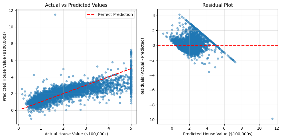
Ideal patterns:
  • Left plot: Points cluster around diagonal line
  • Right plot: Residuals randomly scattered around zero
Error Distribution
Let's examine how prediction errors are distributed.
plt.figure(figsize=(10, 5))

# Error distribution
plt.subplot(1, 2, 1)
errors = (y_test - y_test_pred) * 100000
plt.hist(errors, bins=50, edgecolor='black', alpha=0.7)
plt.xlabel('Prediction Error ($)')
plt.ylabel('Frequency')
plt.title('Distribution of Prediction Errors')
plt.axvline(x=0, color='r', linestyle='--', lw=2)
plt.grid(True, alpha=0.3)

# Absolute errors
plt.subplot(1, 2, 2)
abs_errors = np.abs(errors)
plt.hist(abs_errors, bins=50, edgecolor='black', alpha=0.7, color='coral')
plt.xlabel('Absolute Prediction Error ($)')
plt.ylabel('Frequency')
plt.title('Distribution of Absolute Errors')
plt.axvline(x=abs_errors.mean(), color='r', linestyle='--', lw=2,
            label=f'Mean: ${abs_errors.mean():,.0f}')
plt.legend()
plt.grid(True, alpha=0.3)

plt.tight_layout()
plt.show()

print(f"\nError Statistics:")
print(f"  Mean error: ${errors.mean():,.0f} (should be near $0)")
print(f"  Mean absolute error: ${abs_errors.mean():,.0f}")
print(f"  Most predictions within: ±${abs_errors.quantile(0.68):,.0f} (68th percentile)")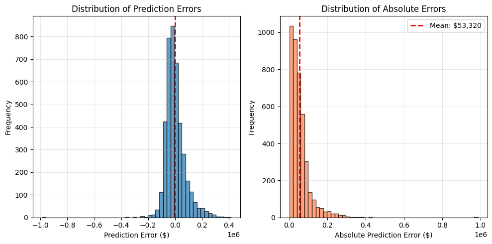
Error Statistics:
  Mean error: $348 (should be near $0)
  Mean absolute error: $53,320
  Most predictions within: ±$60,011 (68th percentile)
9. Key Takeaways
What We Learned
-
The ML Workflow: Load → Split → Scale → Train → Evaluate → Analyze
-
Always Split Data First: Never train and evaluate on the same data
-
Feature Scaling Matters: Linear Regression needs scaled features for optimal performance
-
Prevent Data Leakage: Use training statistics (mean/std) to transform test data
-
Multiple Metrics: MAE, RMSE, and R² provide different perspectives on performance
-
Generalization is Key: Similar train/test performance indicates good generalization
-
Visualize Results: Plots reveal patterns that metrics alone might miss
Linear Regression Strengths
✓ Simple and interpretable: Coefficients show feature importance
✓ Fast to train: No complex iterations
✓ Good baseline: Other models should beat this performance
✓ Reliable: Consistent results, no randomness
Linear Regression Limitations
✗ Assumes linearity: Can't capture complex non-linear relationships
✗ Sensitive to outliers: Squared error heavily penalizes large deviations
✗ No feature interactions: Treats features independently
What's Next?
This notebook taught the fundamental workflow. The next notebook will introduce:
- Pipelines: Automate preprocessing + training in one object
- Multiple Algorithms: Compare Linear Regression with tree-based models
- Proper Validation: Use validation sets to avoid data leakage when comparing algorithms
- Cross-Validation: More robust performance estimation
Best Practices Checklist
✓ Always split data before any preprocessing
✓ Fit scaler/preprocessor only on training data
✓ Use same preprocessing for train and test
✓ Evaluate with multiple metrics
✓ Check for overfitting (train vs test gap)
✓ Visualize predictions and residuals
✓ Set random_state for reproducibility
✓ Document your process clearly